Roles:
Branding
Graphic Design
Client:
HERE Technologies
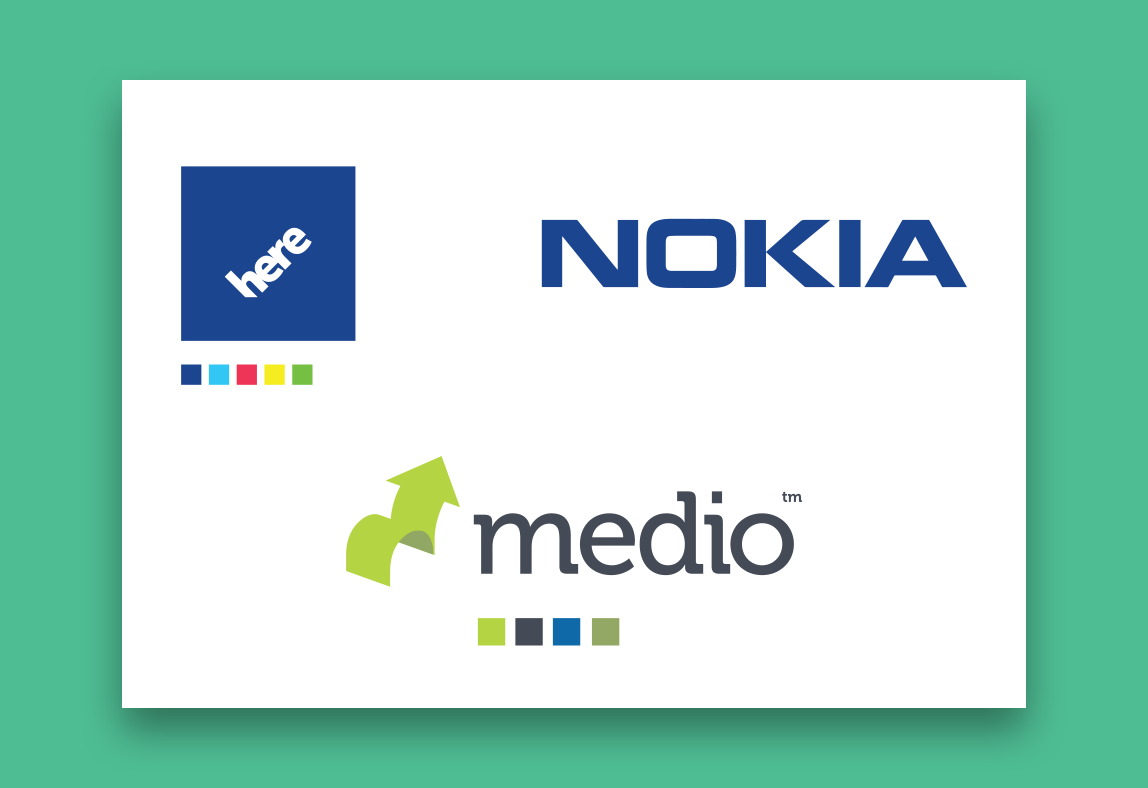
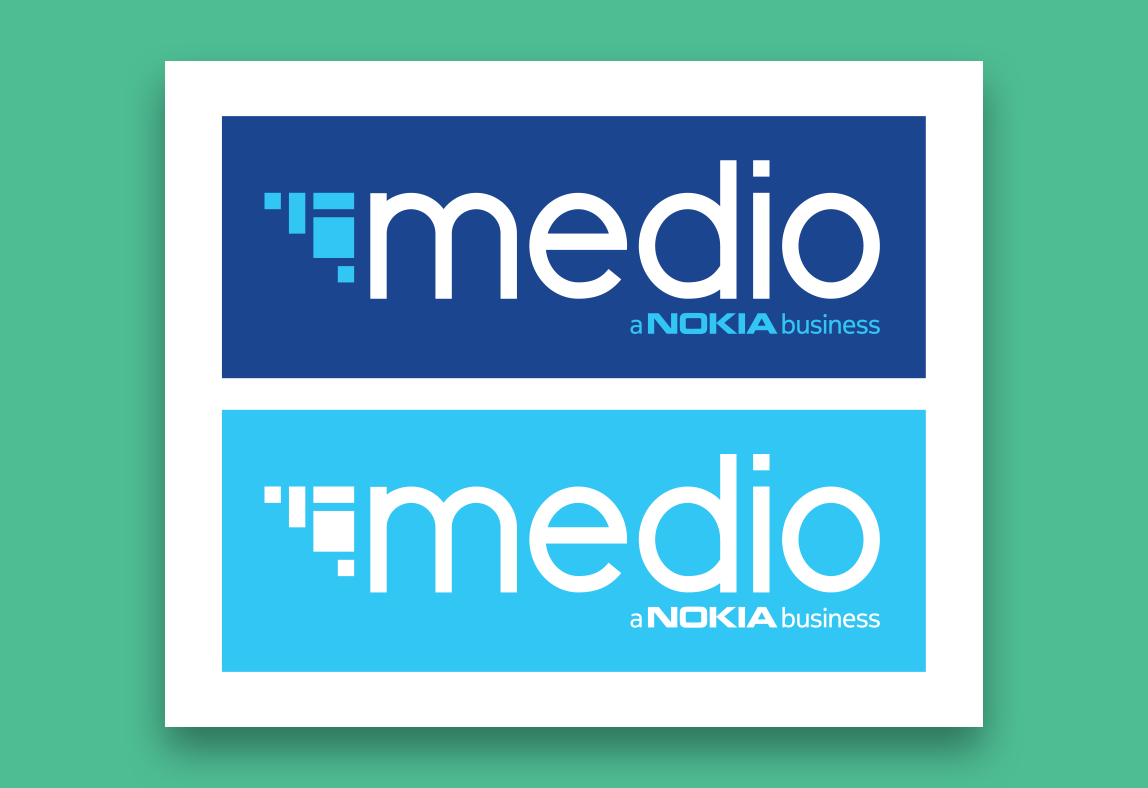
After HERE/Nokia’s acquisition of Medio, the colors and branding of the two entities began to clash which was visually impacting our marketing. My team was in the process of creating a multitude of content that would bridge the gap between Medio and HERE, including the Mobile Marketing Suite. A unified brand language was crucial.
The Problem
Conflicting colors, logotype, and the Medio mark made cohesion an issue. Nokia and HERE’s logos were grounded, in contrast to Medio lockup. This made it difficult to pair them on-screen without creating an imbalance of negative space. Medio was also being pitched as a stand alone business under Nokia, so it was critical that our branding demonstrated that.
The Solution
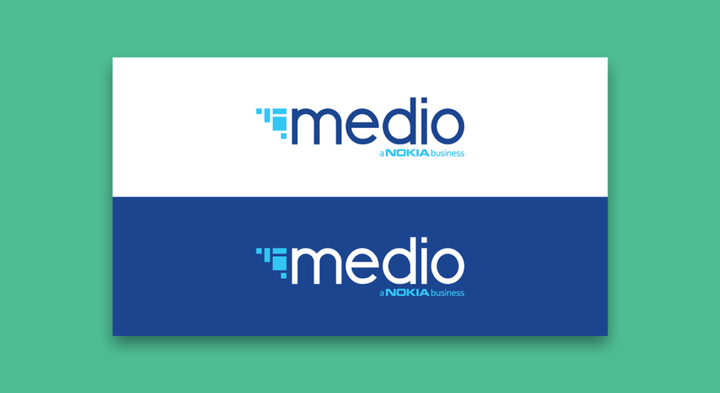
I modified and customized the lowercase HERE font to move away from Medio’s old slab serif. The “arrow” was rebuilt with inspiration from the Canvas of the Mobile Marketing Suite, and a reference to data and analytics – building an image or perception from multiple data points.
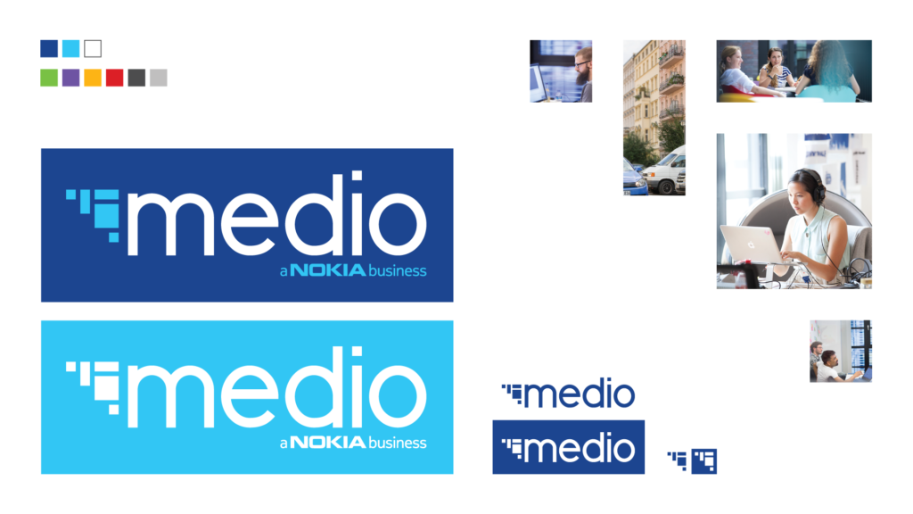
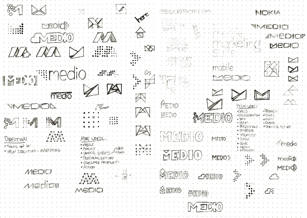
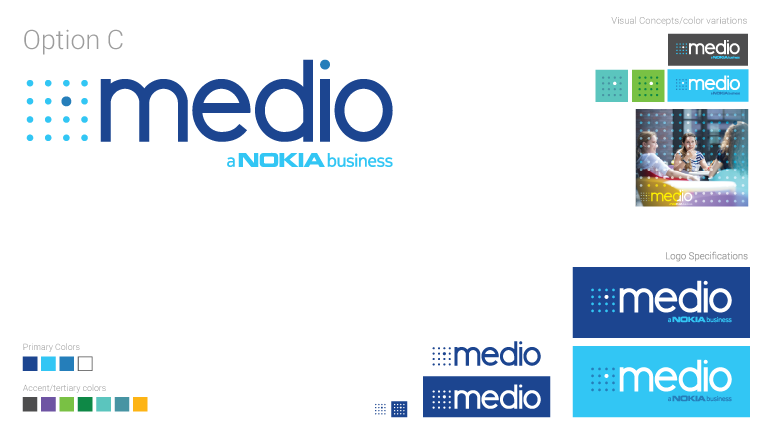
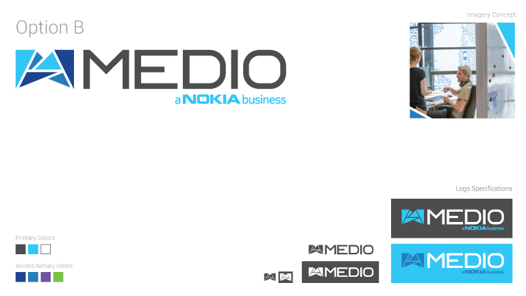
Alternate options from the process: