Roles:
Art Direction
Graphic Design
Illustration
Client:
Plicata Land LLC
Details:
Plicata is a new landscaping and wetland restoration business operating in the PNW. They focus on planting native species, habitat rejuvenation, and preserving the future of the ecosystem. After a year of word-of-mouth contract work, the company needed a professional brand to represent their philosophy and expertise.
OBJECTIVE
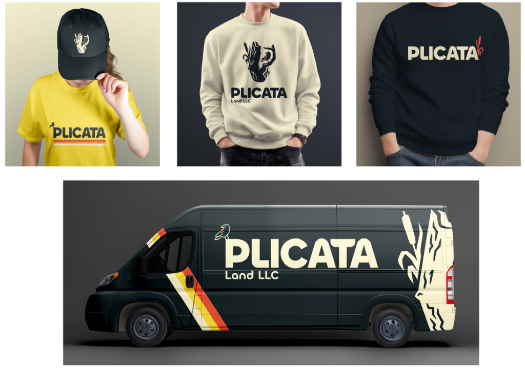
Develop a clear and consistent brand identity to establish credibility and professionalism in the space. Create a scalable system that can be easily adapted across a wide medium – from Invoices and Business cards to a website. Ensure that visuals align with the target audience and brand values.
BRAND DIRECTION
The brand and logo should draw inspiration from the natural landscape of the Pacific Northwest, evoking the aesthetic of National & State Parks and established outdoor brands. Visual elements will be inspired by utilitarian typefaces, carved wood signage, naturalistic photography, and hand-drawn illustration. The identity should reflect the region’s wildlife, biodiversity, and native flora with specific emphasis on the wetland and forest ecosystems specific to the area.
BRAND IDENTITY
Plicata represents preservation, restoration, and cultivation in the Pacific Northwest. Wetlands are the foundation to a stable and thriving ecosystem which requires an expert’s knowledge, skill, and long term dedication.
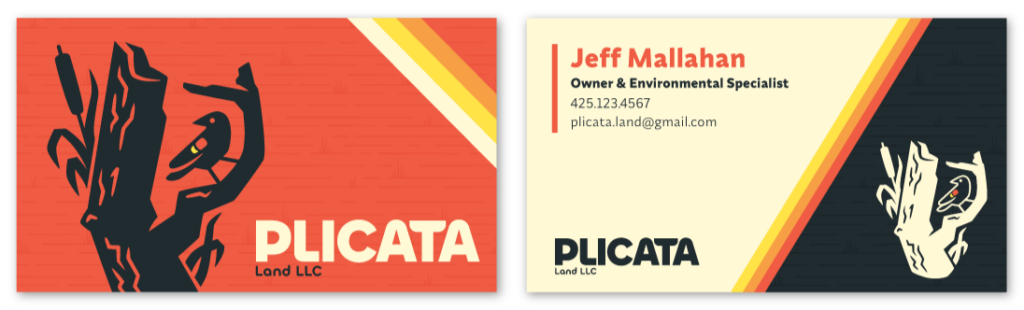
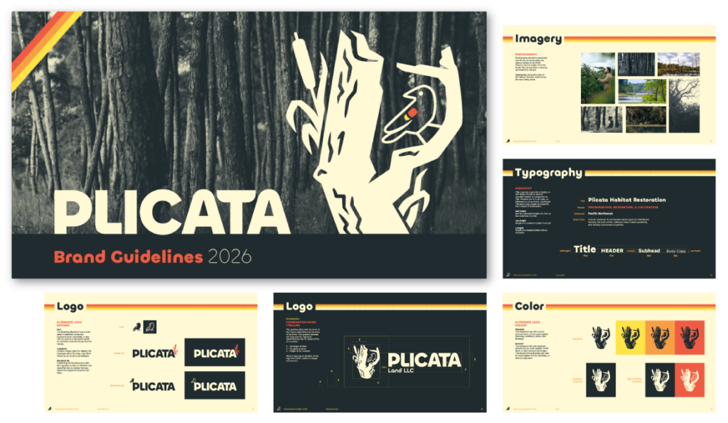
Plicata’s brand is deeply rooted in the PNW, it’s closer related to outdoor adventures and exploration as opposed to construction. The visuals lean into utilitarian and retro colors, a high contrast woodblock inspired logo, and hand-drawn botanical style illustrations.
BRAND GUIDELINES
PROCESS
The project kicked off with a lengthy discovery interview: discussing the history of the company, the type of work that they do, the style and character they lean toward, learning about the market and the niche their company fills, and a lesson on habitat ecology. I used that interview to define the process going forward, to find the perfect fit of visuals and meaning to tell the client’s story through branding.
I started with industry research, trying to find companies that Plicata could stand out from. I found inspiration through mostly ecological and outdoor brands, and I explored a unique look through many rounds of sketches. I kept the logos in sketch form to explore ideas faster and to bounce unique concepts off the client without wasting too much time refining them. With lots of feedback and collaboration with the client we got closer and closer to the best visual and style.
The final identity is truly a representation of the company and client, and I loved every step of the process.
Industry Research
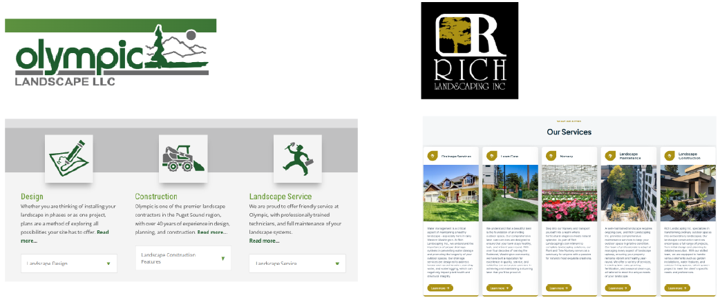
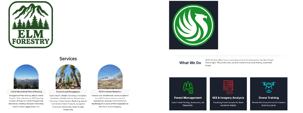
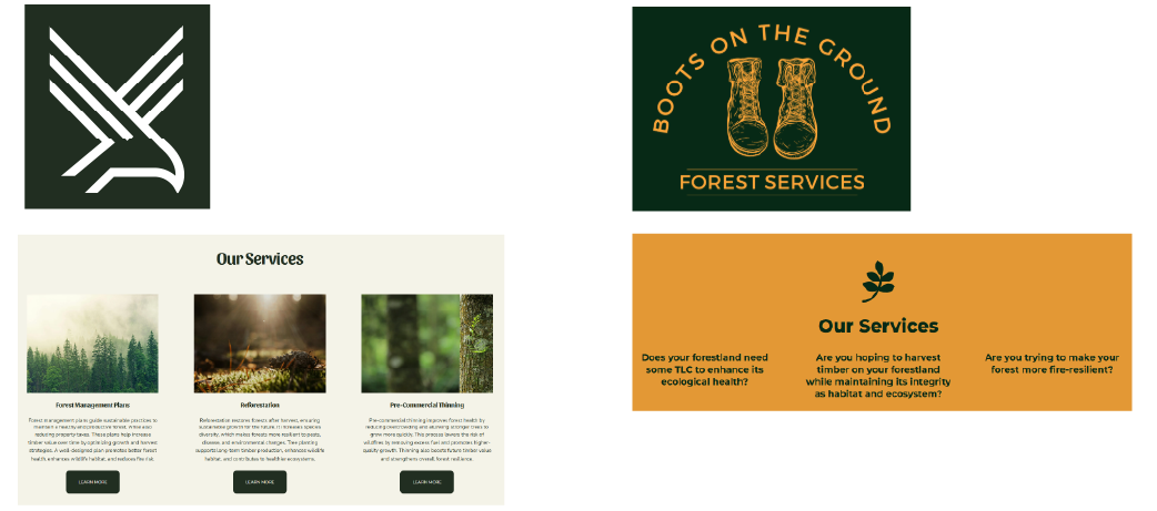
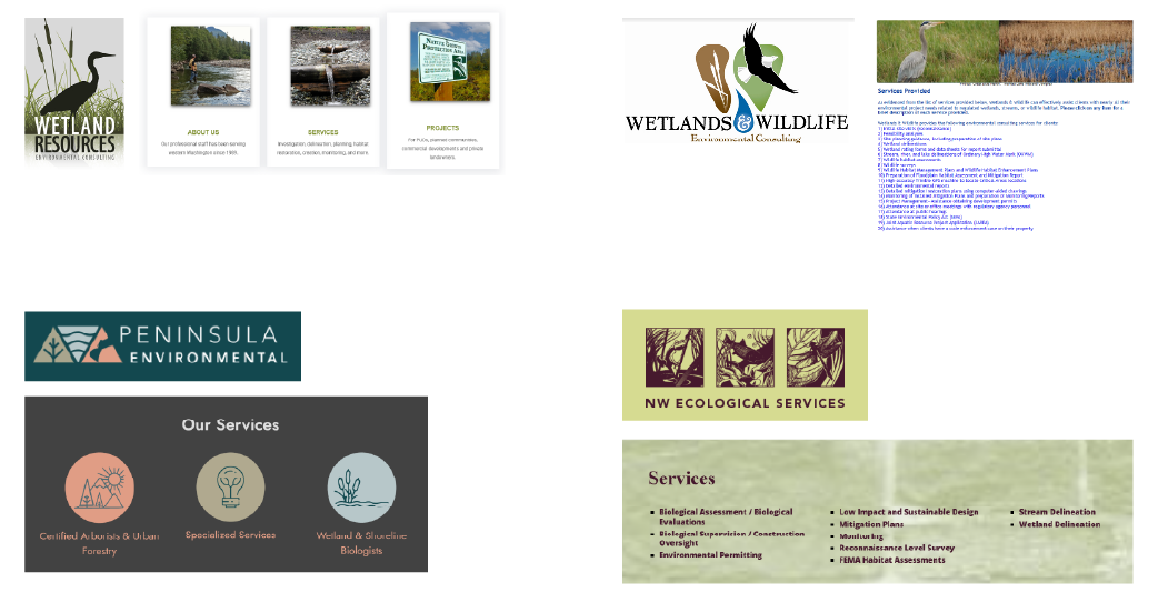
Plicata differentiates itself by focusing on true habitat restoration, not just doing the bare minimum to appease building regulations. The team dedicates years of followup to monitor the wetlands and habitats they helped to restore. They source their own native plants to ensure that its ecology includes more than just flora, but brings the return of fauna to the area.
They are more than landscapers, they do more than land management, and execute the plan after environmental services determines what needs to be done.
Industry Research: Landscaping
Industry Research: Land Management
Industry Research: Forestry
Industry Research: Environmental Services
Inspiration
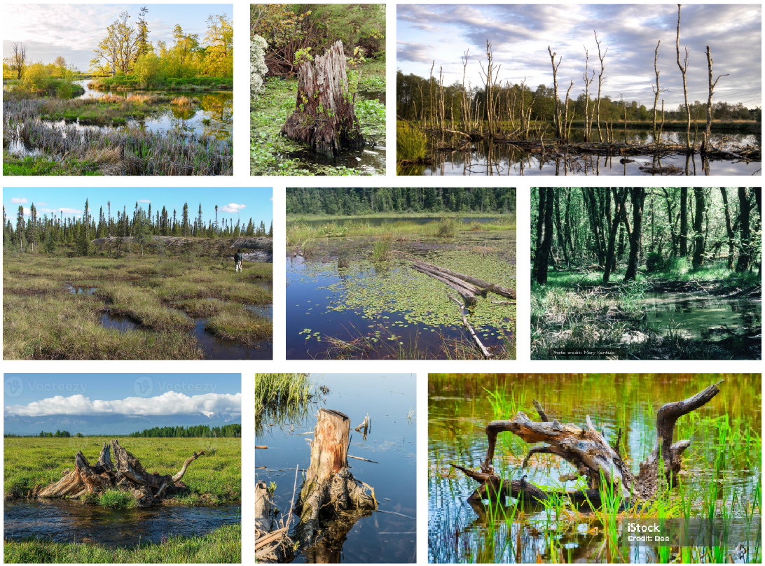
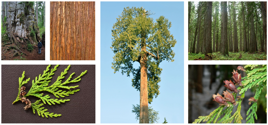
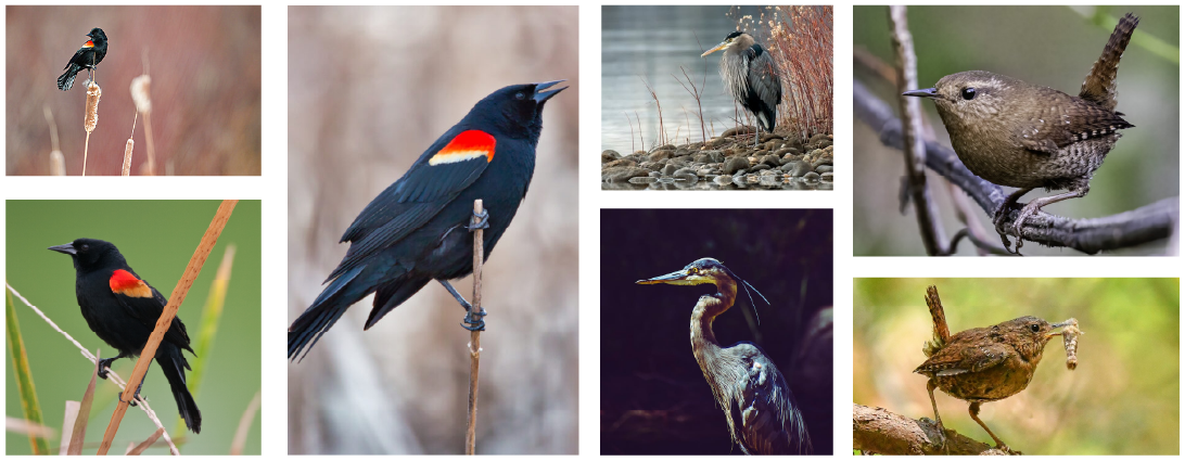
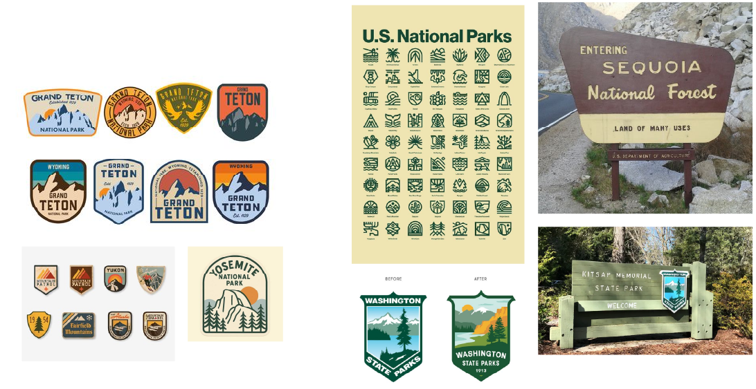
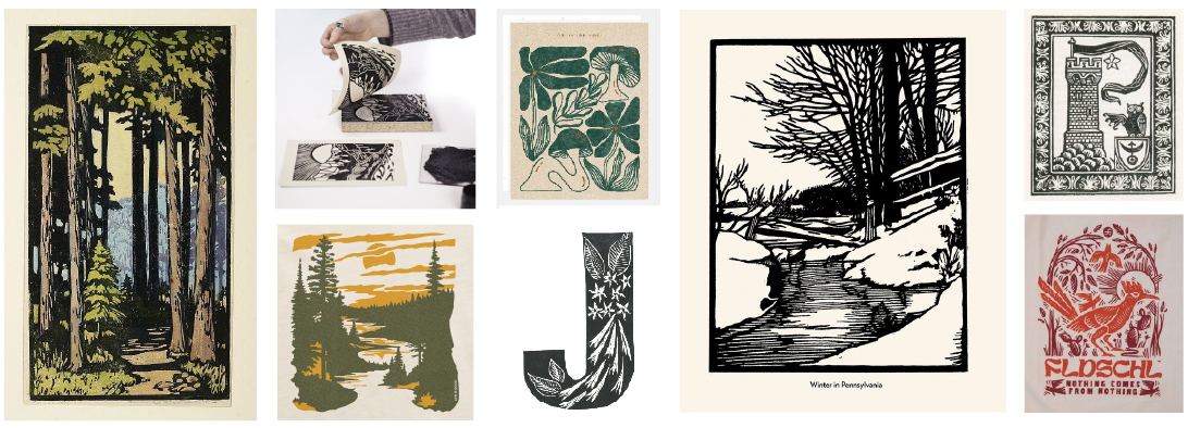
Thuja Plicata is the Latin word for the Western Red Cedar, and inspired a lot of concepts around the bark, sprigs, and pinecones. Wetlands and snags (dead/dying trees in a wetland) along with the animals that call it home were the obvious and major inspirations for the brand. Northwest birds also hold a lot of personal meaning to the client: GBH (Great Blue Heron) is a staple of PNW wetlands, and Pacific Wrens and Redwing Black Birds are often found on cattails and gathering vegetation. Outdoor & national park signage also played a big role in inspiring the look, along with woodblock prints and hand carved iconography.
Wetlands & Snags
Thuja Plicata – The Western Red Cedar
Wetland Birds – Redwing Black Bird, Blue Heron, Pacific Wren
State Park Signage & Badges
Woodblock Prints
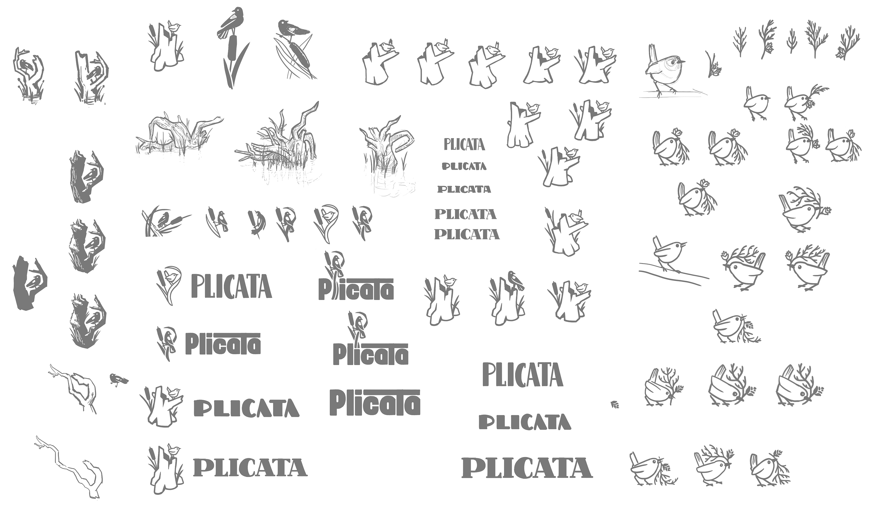
Sketches
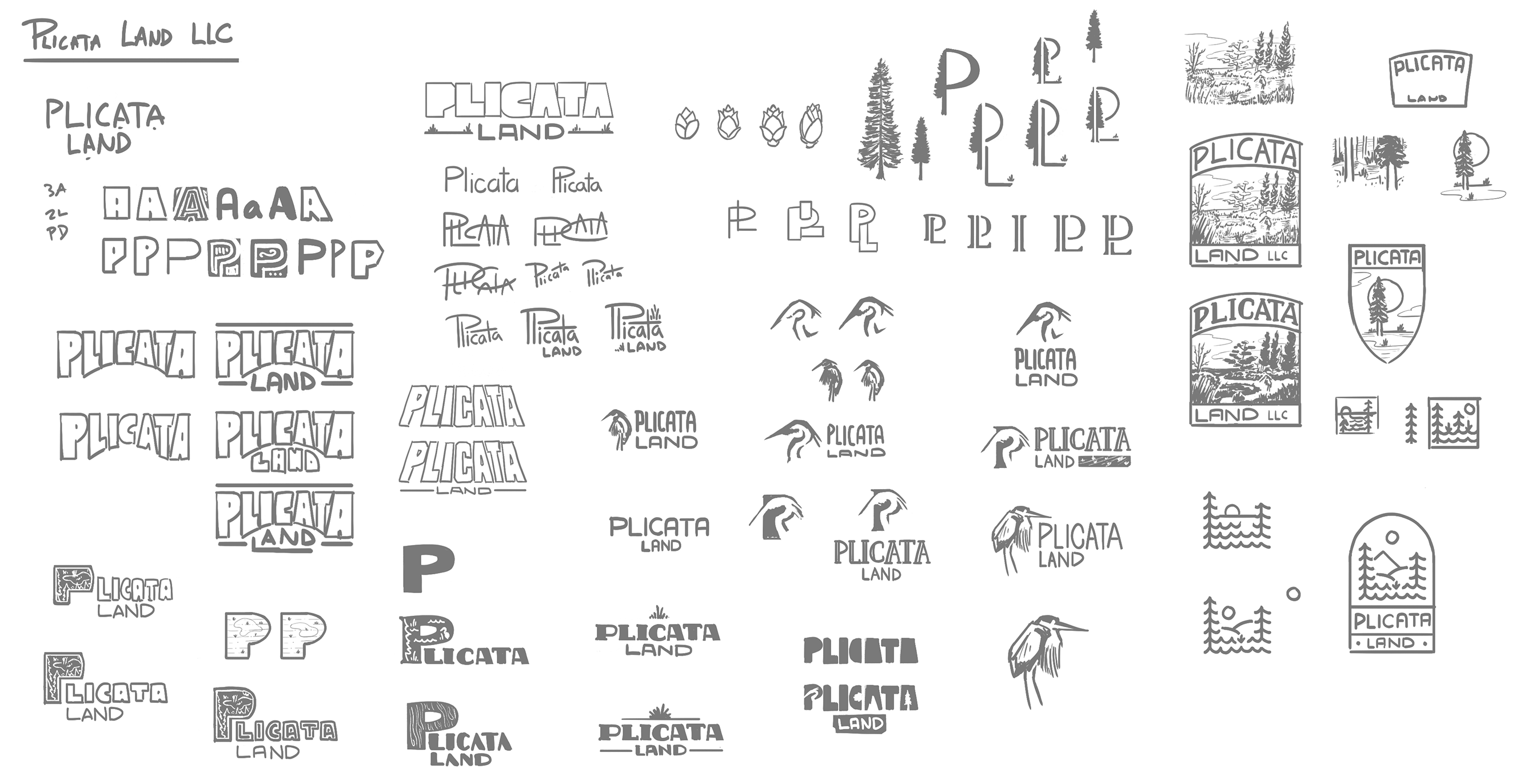
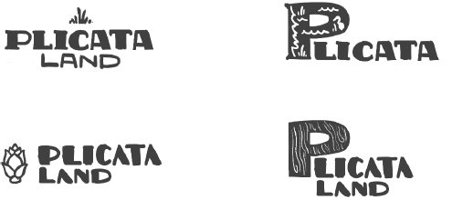
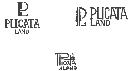
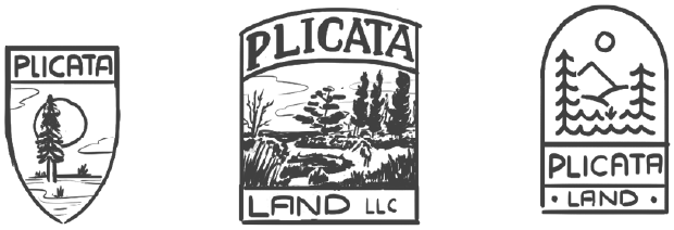
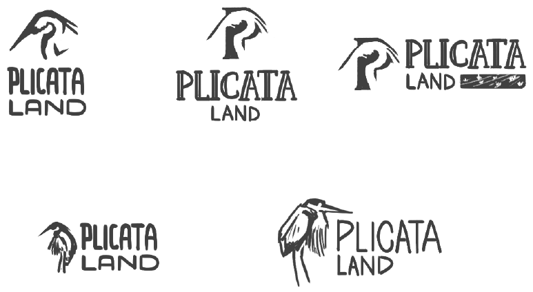
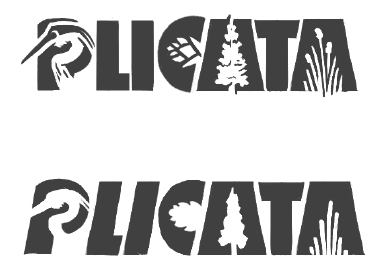
The first round of sketches explored the more woodblock print and heavy font approach, along with exploring how a GBH could be incorporated into the logo. I tried to work the silhouette of the western red cedar into a few options along with the badges.
Original Sketches
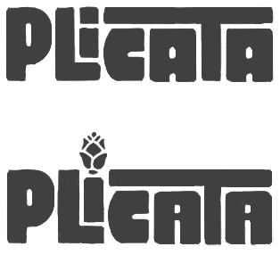
Heavy Fonts & PL Brand Mark
Badge & Woodblock Print
Blue Heron Brand Mark
Round 2 Concepts
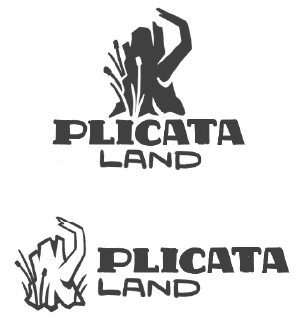
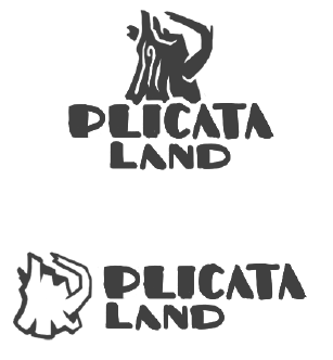
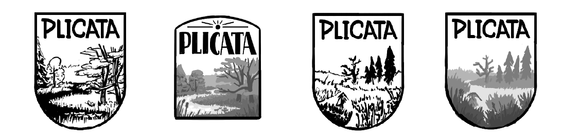
It was agreed that the GBH was used too often in other wetland focused brands, and the client wanted to stay away from that as the main mark even though they loved the style. They also really liked the heavy font approach and also wanted to focus on the habitat of the wetland. I explored the use of a snag to show the duality of life thriving from death, a stump that is invaluable to the ecosystem. I also refined some badges to explore what a more complex branding could look like.
Original Sketches
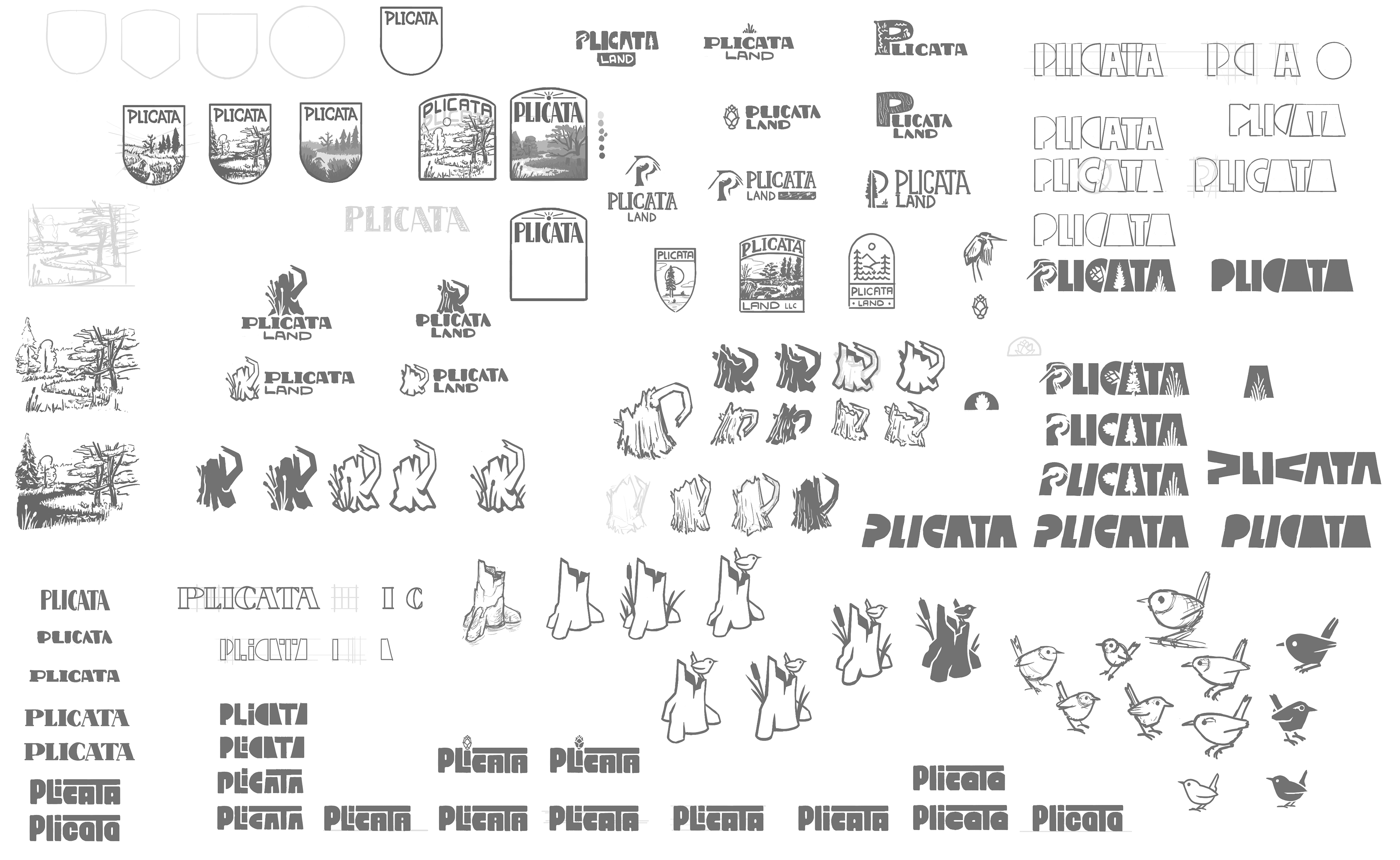
Blocky Fonts & Negative Space
Stump & Snag Brand Mark
Badge & Woodblock Print
Round 3 Concepts
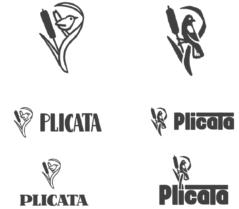
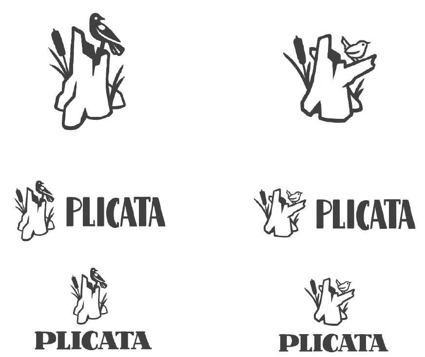
The snag was a huge hit with the client, but they were worried it would come off as just a forestry or logging brand. I decided to incorporate a bird that could often be found in a wetland among the snags and cattails – the Pacific Wren, and the Redwing Blackbird. I showcased both birds with the snag, and sitting among the cattails.
Original Sketches
Cattail Brand Mark: Pacific Wren & Redwing Black Bird
Snag Brand Mark: Pacific Wren & Redwing Black Bird
Final Options
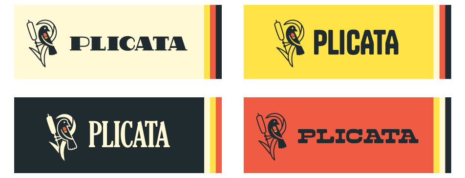
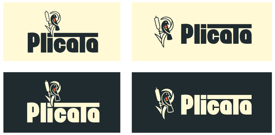
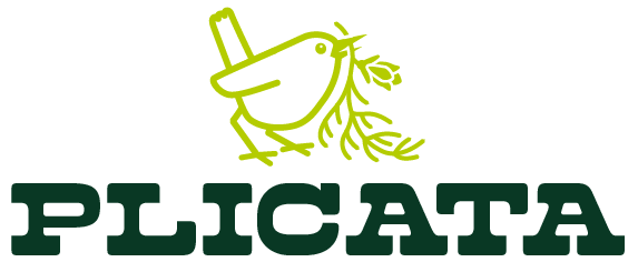
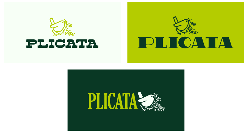
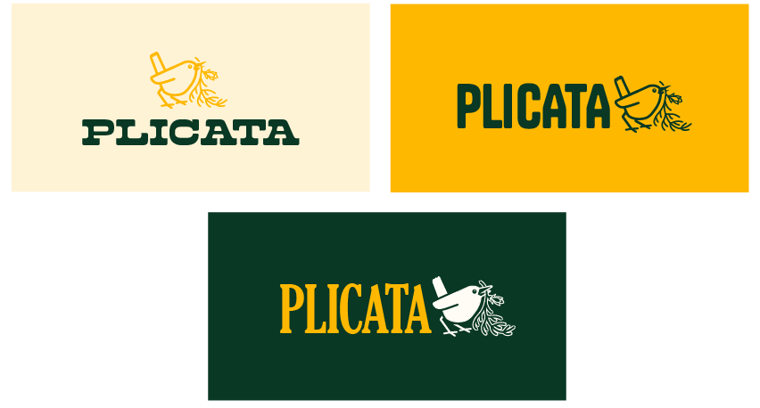
The concepts were well defined at this point and I moved on to fully realize them and mock them up with color and typography, some with fonts and some handmade type. The Redwing Blackbird’s color palette was major inspiration for the branding. Because of its small size, the Pacific Wren could be illustrated holding a sprig of the Western Red Cedar, with a palette inspired by the colors of the forest. Finally I pushed the snag design to look more hand carved, complex but minimal.
Brand Mark: Redwing Black Bird & Cattail
Brand Mark: Pacific Wren & Plicata Sprig
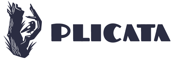
Brand Mark: Snag & Redwing Black Bird
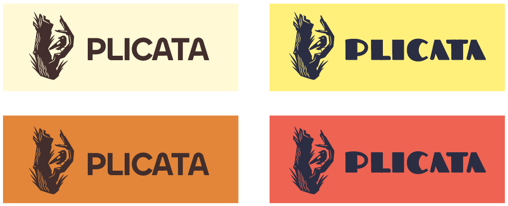
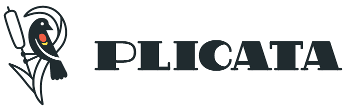
Final Logo
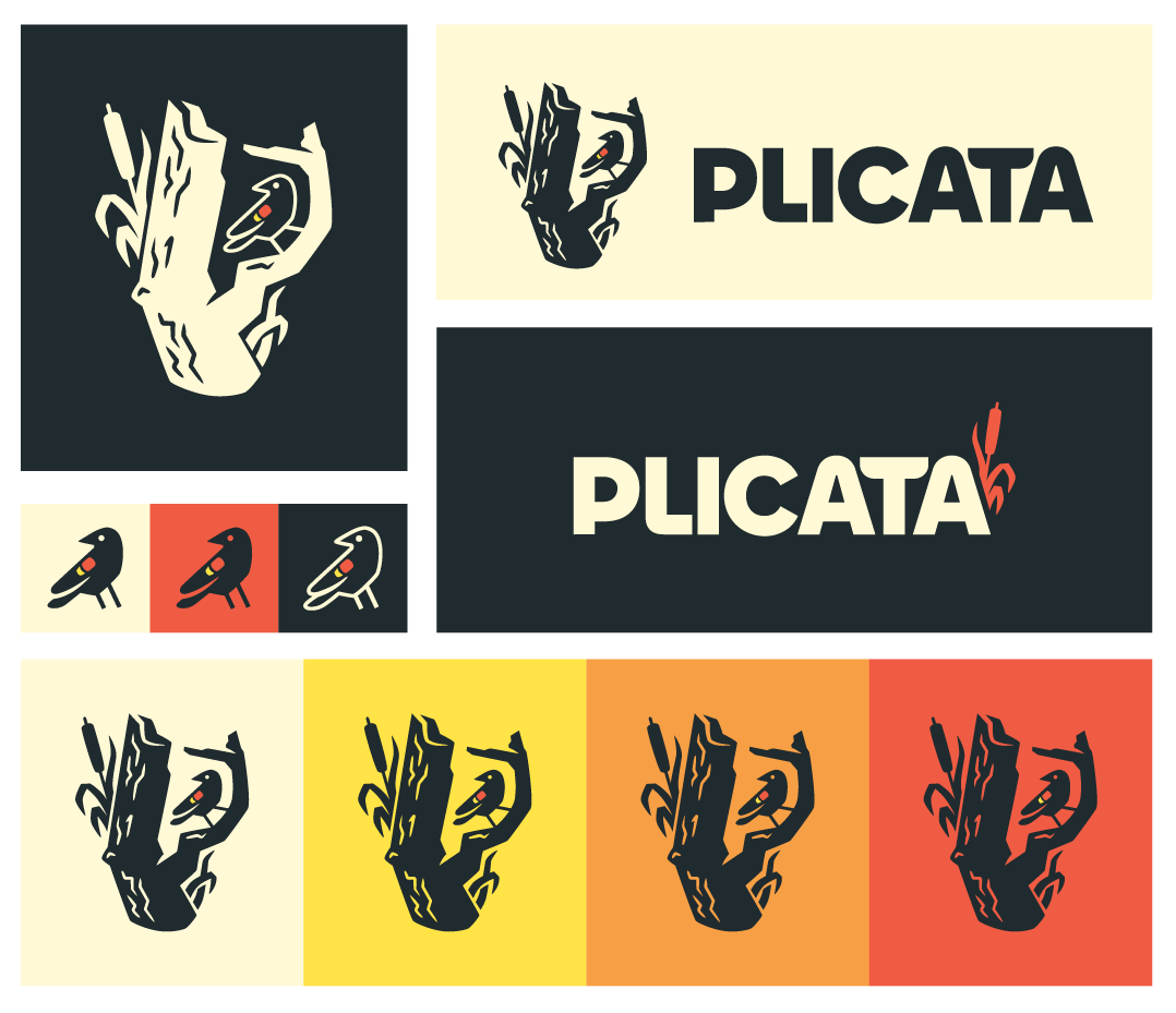
All of that feedback brought us to this final design: an integration and mixture of so many previous ideas to represent the brand and build the identity of life growing from death. The thriving cattails and blackbird among the snags of the wetland. The colors inspired by the striking beauty of the redwing blackbird and modern retro style. The snag logo itself is flexible and dynamic, and is able to be broken up and simplified without losing its meaning.