Roles:
Art Direction
Graphic Design
Motion Design
Client:
John L. Scott
Details:
While on the John L. Scott Marketing team, I led a full rebrand of the Monthly Housing Updates over a three-month period. After creating and getting approval on the initial designs, I guided the team in building the remaining assets and developed custom scripts to streamline the production process. With my leadership and expertise, our team saved ~20hours of production time every month.
THE PROBLEM
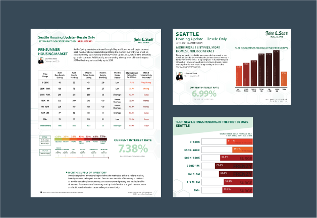
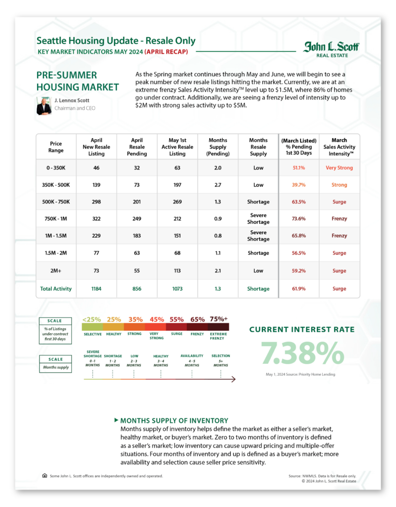
The previous process was outdated, inflexible, and time-consuming. Although it utilized InDesign’s Data Merge for input for the main fliers, all custom styling, like color coding and graph creation, had to be done manually for each piece of material.
This process also repeats every month.
THE SOLUTION
Create a design system that is scalable, code-driven, and modern.
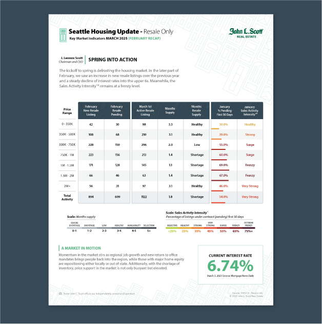
I designed a clean, eye-catching new layout focused on readability and flexibility, while introducing a new functional graph to the fliers. Using InDesign scripts and After Effects expressions, I built an automated, adaptable system from the ground up.
THE PROCESS
I began by breaking down the existing design into base sections, looking for ways to reorganize while adding functionality. The graph was a key pain point – it needed to be simplified without confusing regular readers with drastic changes.
The design language of the PDF flyer would be translated into the rest of the Housing Update so it was important to start off with a strong, well thought-out concept that was flexible enough to adapt into a landing page, a postcard, static and motion graphic social media posts, and email. It also needed to fit within the constraints of the Data Importing system and scale to repeat for ~50 individual regions.
Wireframing
The flyer was the starting point for the entire redesign, and would establish the structure for the rest of the assets. It was important to keep the layout of the flyer familiar for legacy customers, while enhancing readability and simplifying the structure.
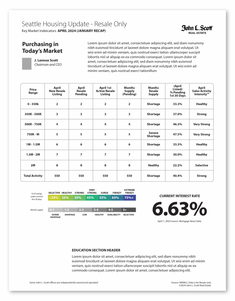
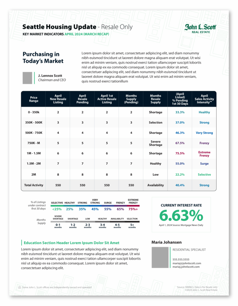
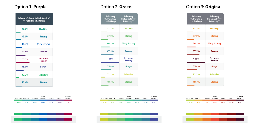
I stripped the original flyer down to a base wireframe to better visualize and separate the important sections. I then created 3 unique concepts with this structure while playing a bit with layout and hierarchy. I also explored new color-coding options to improve contrast and attempt to move away from harsh reds, which could be perceived as overly negative.
Starting Designs
Original
Base
Bento
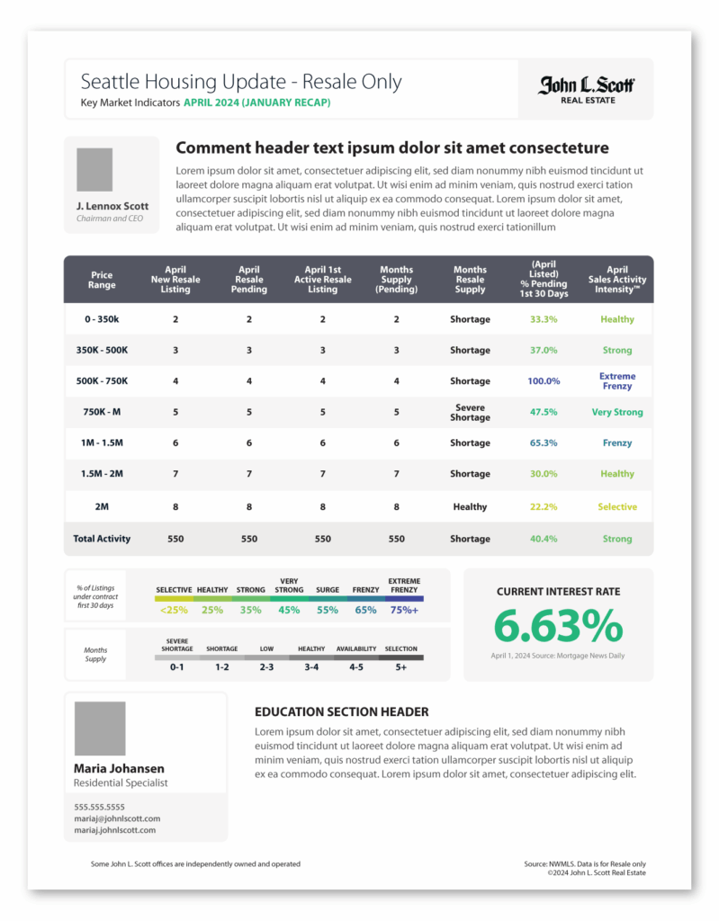
Waves
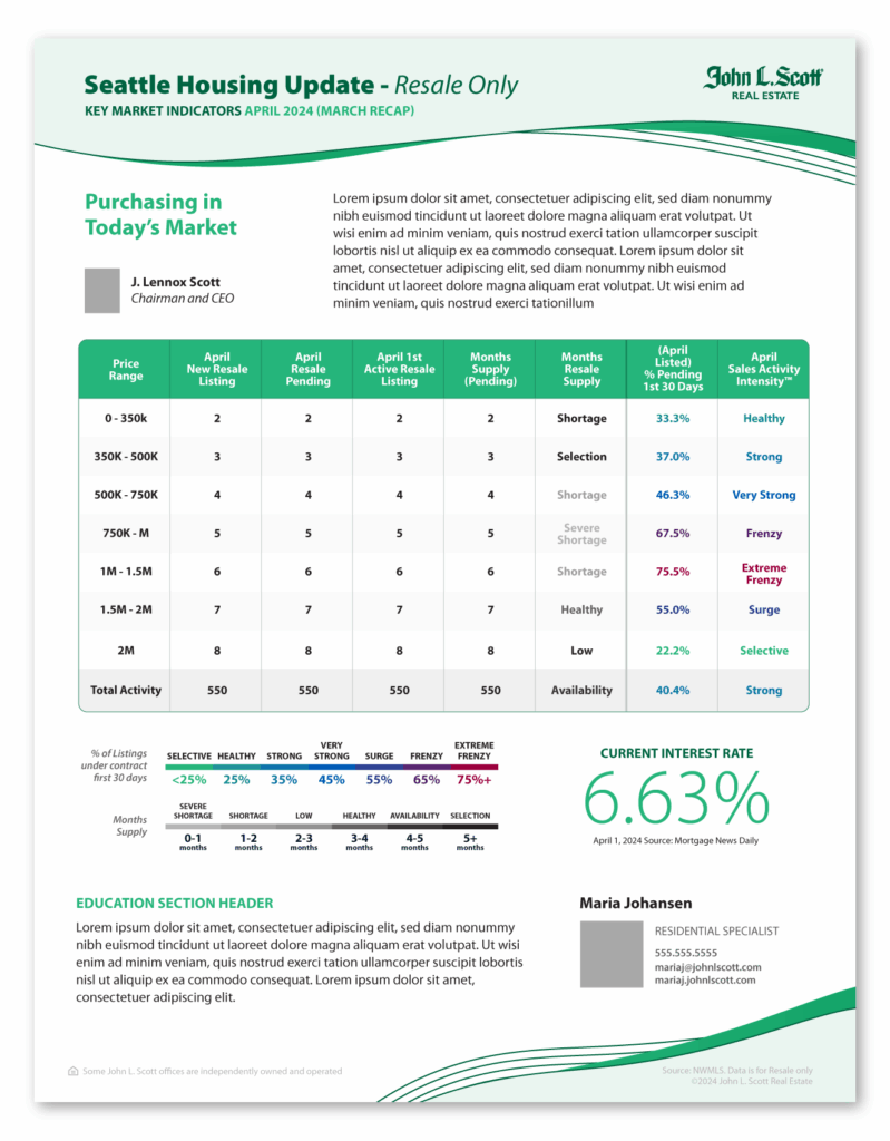
Doors
Graph Color Options
Final Options
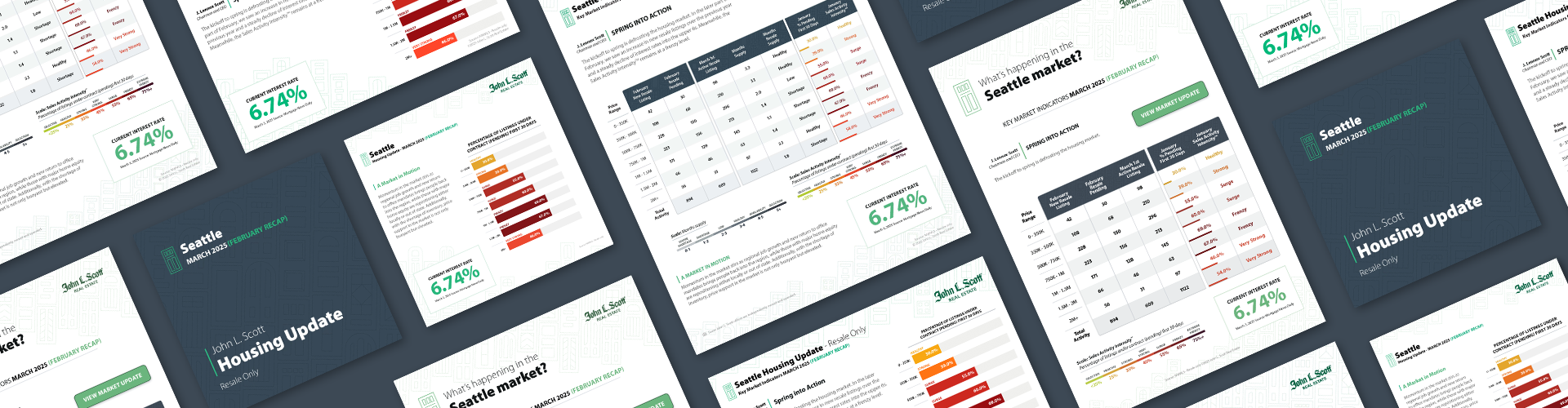
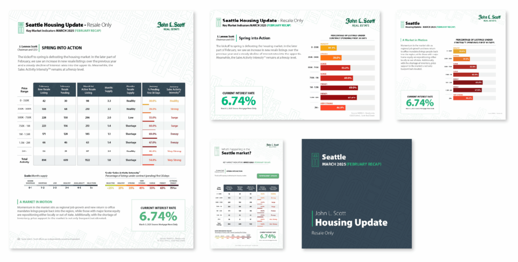
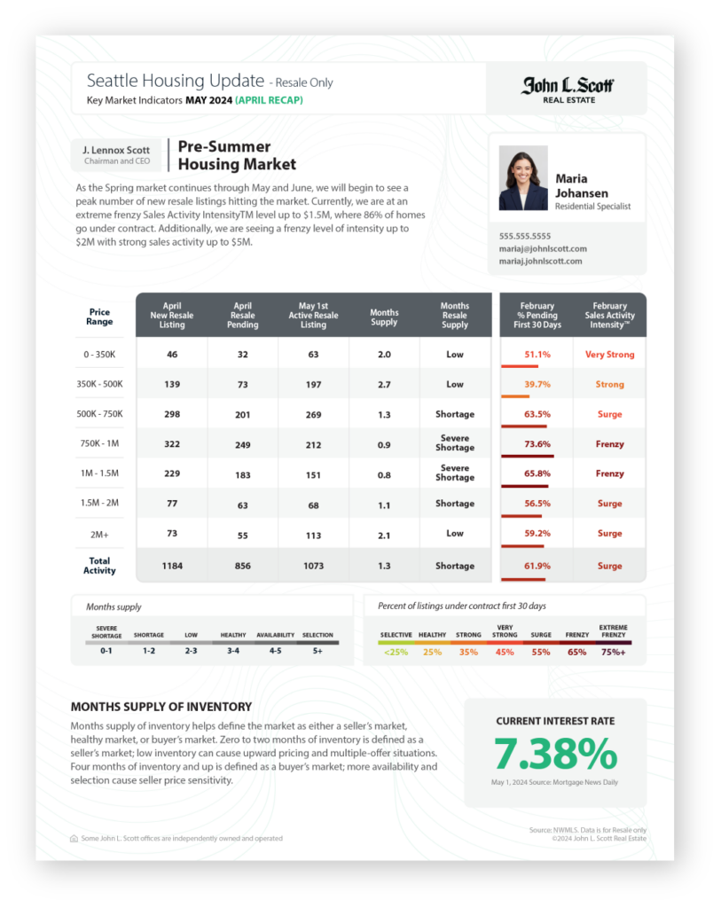
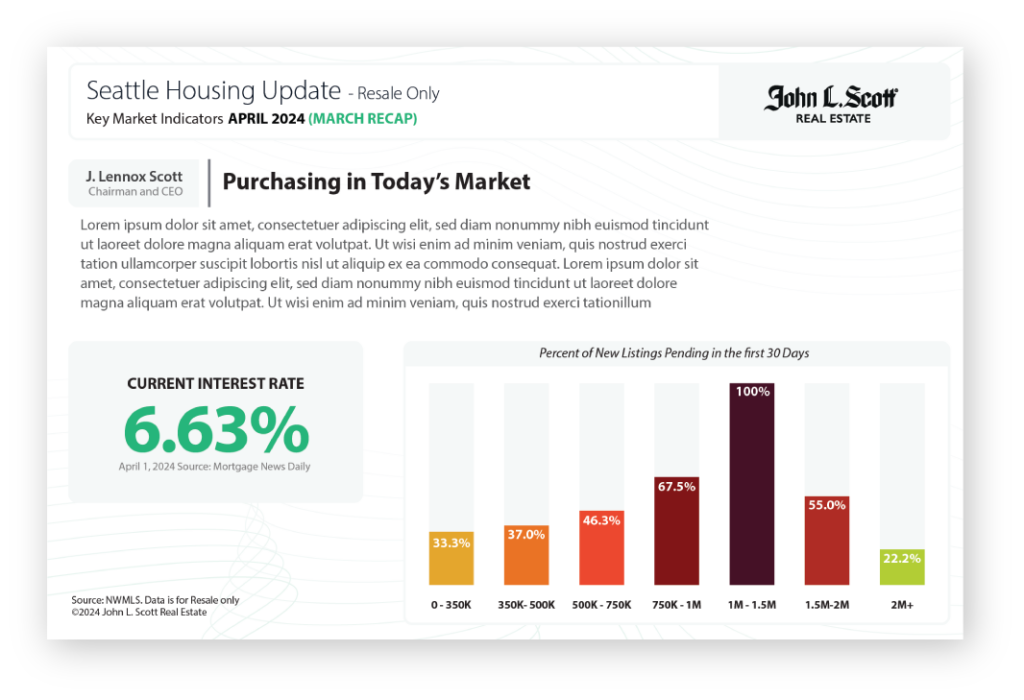
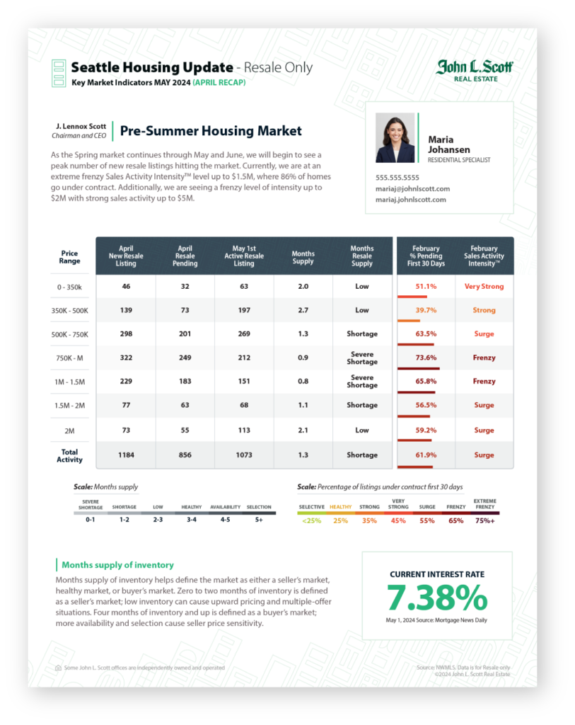
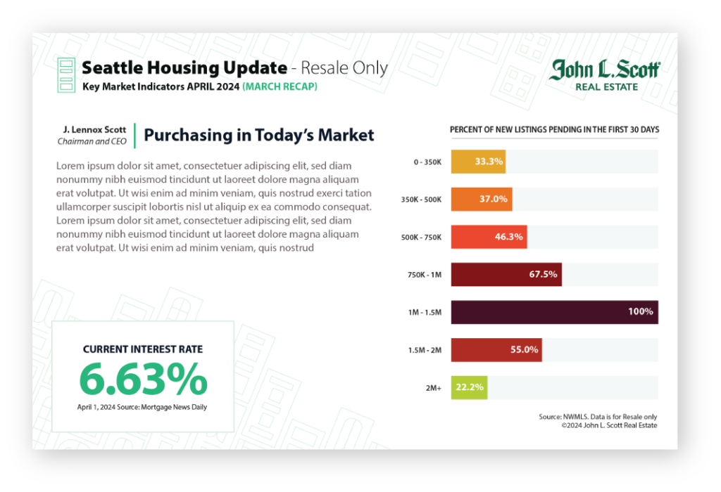
The stakeholders decided that the two strongest concepts for the flyers were the Bento and Doors designs. I spent the next round of feedback refining and developing the flyers for both and mocked up a few options for postcards and social media posts. This helped give the stakeholders a better vision for what the final product would look like.
Bento Design – Flyer and Postcard
Doors Design – Flyer and Postcard
CODE DRIVEN
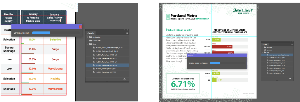
I created two different scripts to accomplish the most tedious of tasks – color coding percentages and intensities on every flyer, and creating graphs. The flyer script runs through every page in the document looking for the specific ‘Intensity’ labels inside a table, determines the color, and applies it to the adjacent cell. Then scales a rectangle based on percentage in the adjacent cell.
The second script is for the Postcards and Social media posts. It first checks which format the asset is, then it reads data from a hidden table, creates and custom formats the graph based on that data, and color codes each bar.