Roles:
Art Direction
Graphic Design
Illustration
Client:
Seaglass Coffee & Bakeshop
Details:
Seaglass is a brand new Coffee and Bakeshop opening in West Seattle in the renovated space of the old Alki Cafe. It’s a community-focused shop with inventive pastries and specialty coffee, all incorporating seasonal Northwest ingredients and local products.
OBJECTIVE
Develop a clear and consistent brand identity to establish trust and collaboration in the community. Create a scalable system that can be easily adapted across a wide medium – from physical signage, packaging material, a custom website, and business cards. Ensure that visuals align with the target audience and brand values.

BRAND DIRECTION
The brand and logo should draw inspiration from nature and the beaches of the Pacific Northwest. It should invoke the imagery of the outdoors but with a clean handcrafted touch. Visual elements will be inspired by the cut glass, watercolors, and ink script as well as the world of coffee and baked goods. The identity should be steeped in the community, showing a welcoming and non-pretious air.

BRAND IDENTITY
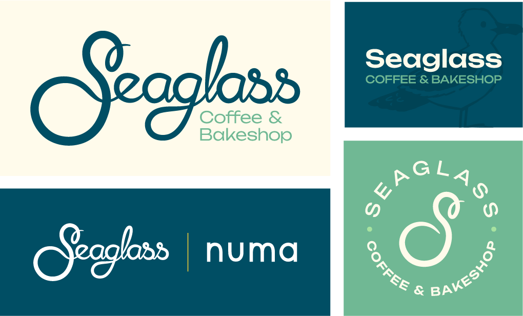
Seaglass is everything that a local, seasonal, & community based coffee and bakeshop should be. It’s built from the ground up to serve and connect whether it’s brewing the best coffee, baking delicious pastries, or hosting local events. The identity is rooted in community, conveying a welcoming and unpretentious atmosphere.
The brand draws inspiration from nature and the beaches of the Pacific Northwest, and evokes the feeling of outdoors while maintaining a clean, handcrafted feel. The visuals are inspired by the beach, cut glass, watercolor textures, and ink script without being kitsch or gaudy.


BRAND GUIDELINES

PROCESS
This project started the way all large branding projects start: with a long discovery interview with the client. Learning the clients story and values, their audience, understanding their market, and getting the full picture of their vision. I took that discovery and focused it on my industry research, finding where their identity could fit, how it could stand out and differentiate itself while aligning with the personality and vision of the client.
From there I started to develop multiple ideas, filtered those into sketches and concepts, and refined, refined, refined. With feedback along the way we found the identity for the brand, the perfect style of the client, and best fit for the market. It tells the story of the client, and shows the handmade care they put into everything they do.
Every step of this process was a collaboration, and an absolute joy to create.
Industry Research
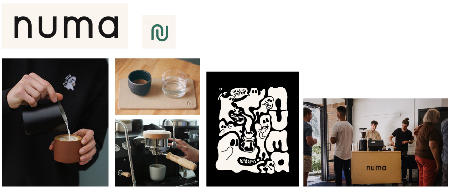
Seaglass differentiates itself in many ways, but for an industry that either defines itself as a Cafe that sells baked goods, or a Bakery that sells coffee – Seaglass will serve the highest quality coffee (run by Numa Coffee) along with a top tier bakery run by a highly reviewed chef.
It was important to research both successful Cafes and Bakeries to understand where they succeed and how to be unique.
Industry Research: Numa Coffee
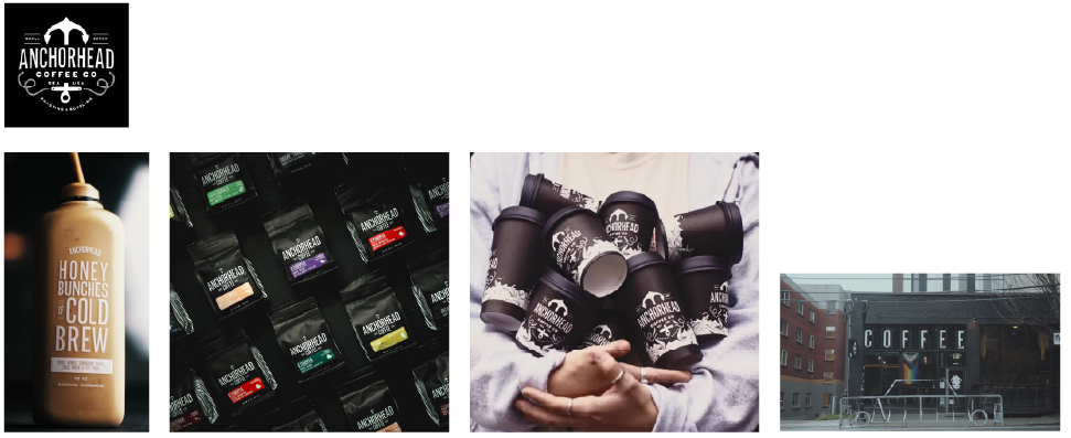
Industry Research: Anchorhead Coffee Co
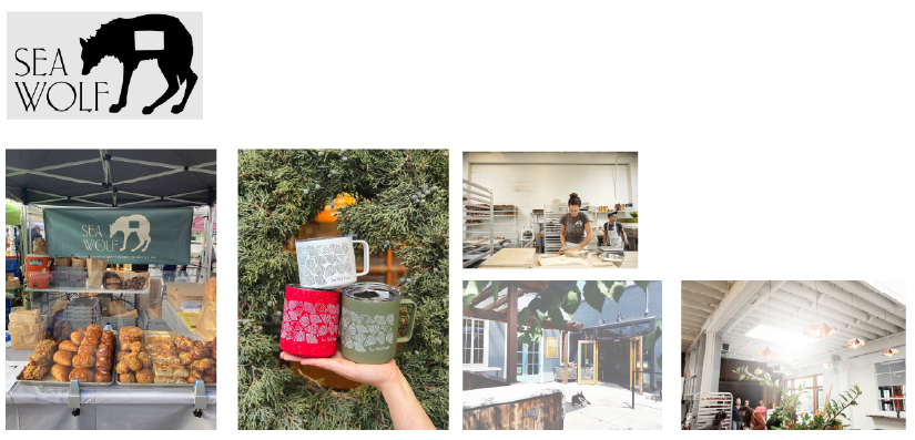
Industry Research: Sea Wolf Bakery
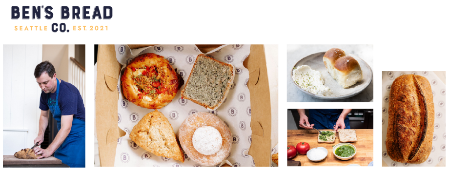
Industry Research: Ben’s Bread Co
Inspiration
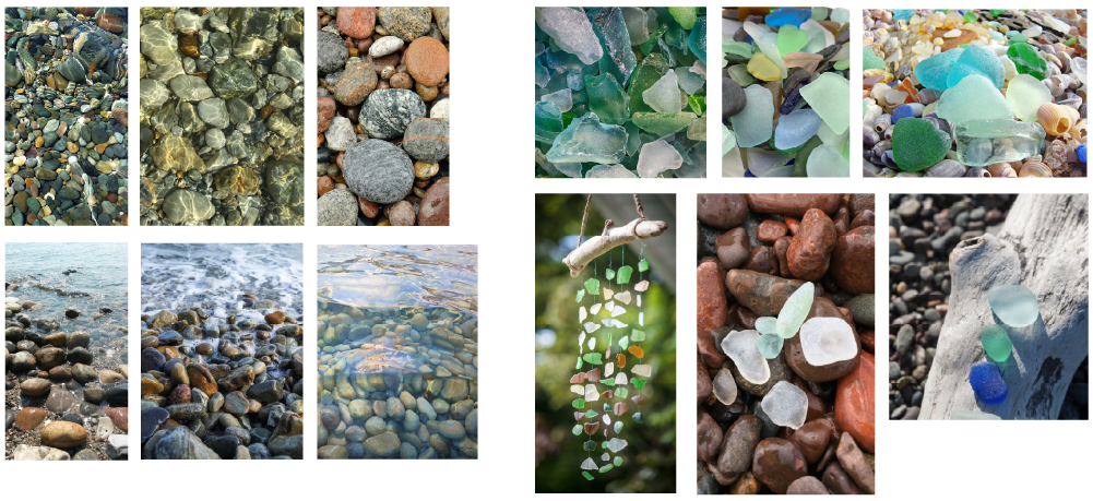
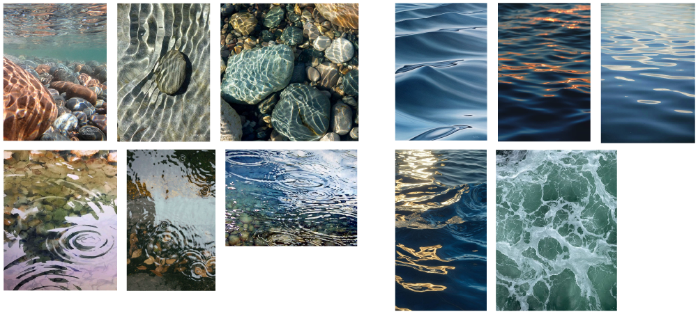
Pacific Northwest, Local, Seasonal. Guiding representations of what Seaglass is all about. Supporting local farms and small businesses, purchasing what’s available, and growing the community. The inspiration for the logo comes directly from the PNW, the beach, the water, the people, and the vintage handmade feel.
PNW, Seattle, Alki
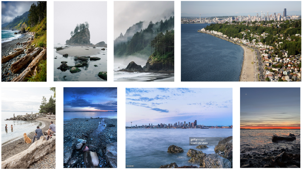
Beach rocks, Sea Glass
Water Ripples, Waves
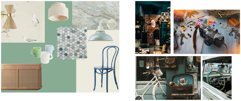
Design Mood board, Vintage asthetic
Sketches & Early Concepts
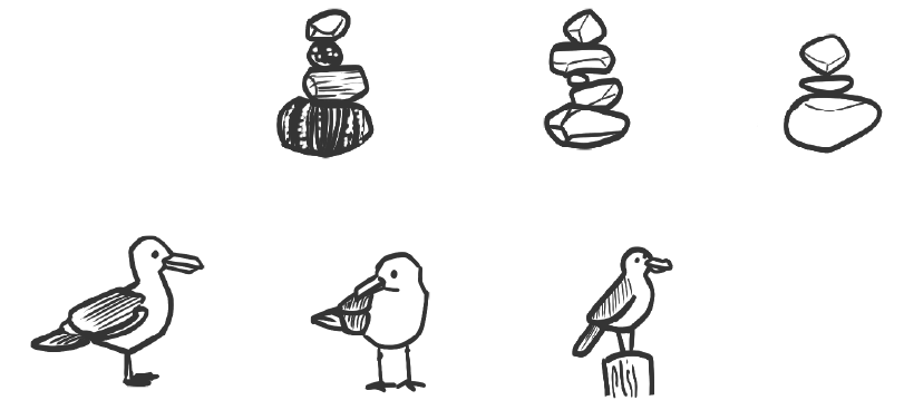
The first attempts to capture the PNW into a cafe & bakeshop logo. Some very literal, some more beachy, and some a bit abstract. As you can see, the Seagull and the script font show up multiple times, and kept coming back to.
I first presented the clients with a wide range of sketched concepts, to get a broad feel of what they were looking for. This made it much easier to completely remove some ideas, while diving deeper into others.
Early notebook sketches
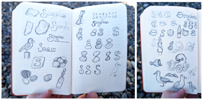
Refined sketches and ideation
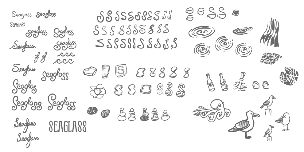
First round of proposed concepts
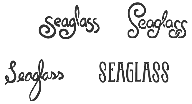
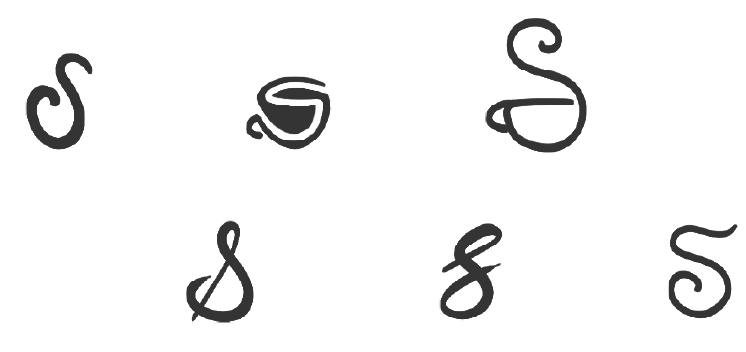
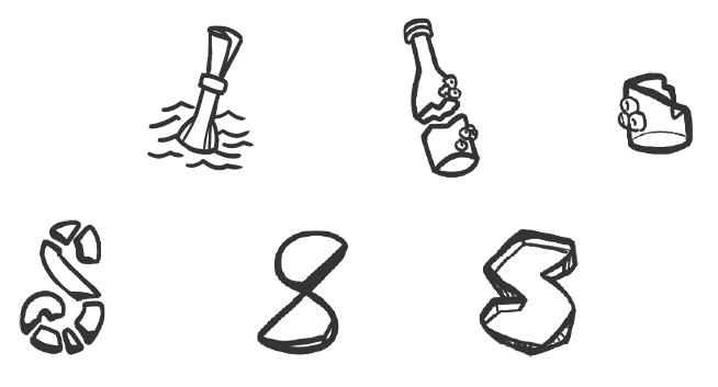
Refined Concepts
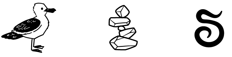
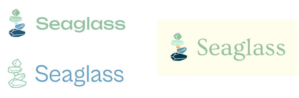
The clients chose to move forward with the Seagull, Rockstack, and Script S as a Logomark. They immediately gravitated toward the Seagull which was initially inspired by a wallpaper they were installing into the bakeshop. The Rockstack was also a favorite, and a requirement for anyone to do while visiting the beach. The Script S was kept initially to see the possibilities of a logotype created with a handmade script.
Three chosen options: Seagull, Rock Stack, Script S
Seagull Brand Mark
Rock Stack Brand Mark
Script S Brand Mark & Logofont
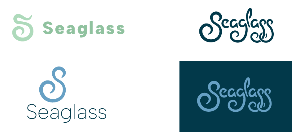
Final Design Proposals
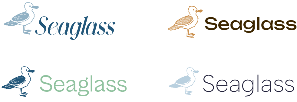
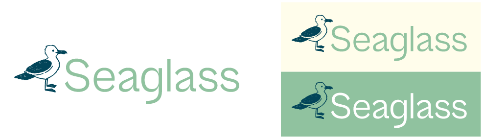
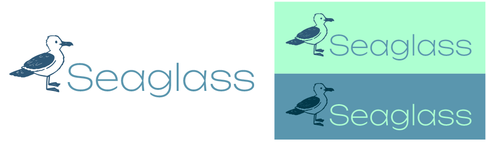
The clients settled on two final options – the Seagull Logomark and the Script logotype. After receiving feedback about the style and shape of the script, I spent days working on three different variations while creating some extra color palette options for variety.
Seagull Combination Mark: Two palette options
Script Combination mark: Three styles and color palette options
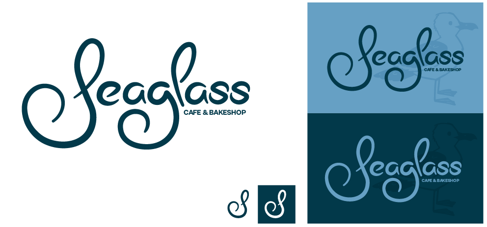
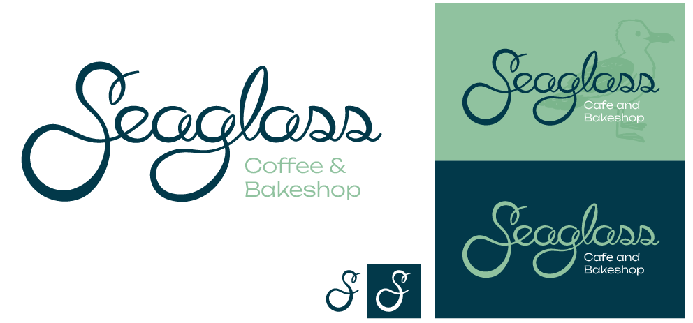
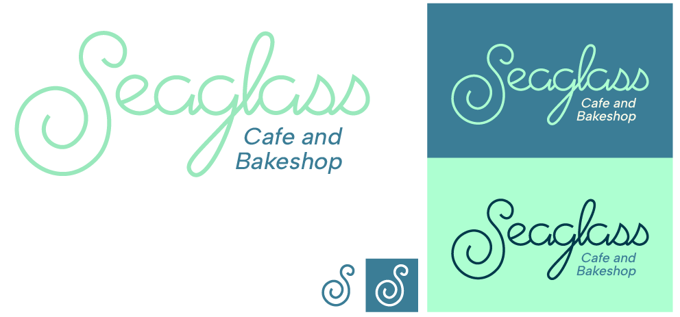
Final Approved Design
The clients loved the more looping script, with larger contrast in stroke width without being too chunky. I refined it a bit more, cleaned up the curves, reduced some of the business to help with readability, and the final design was approved. The Seagull was still a favorite and was working into the Identity as a mascot and secondary logomark to add more personality and style to the brand.